OVERVIEW
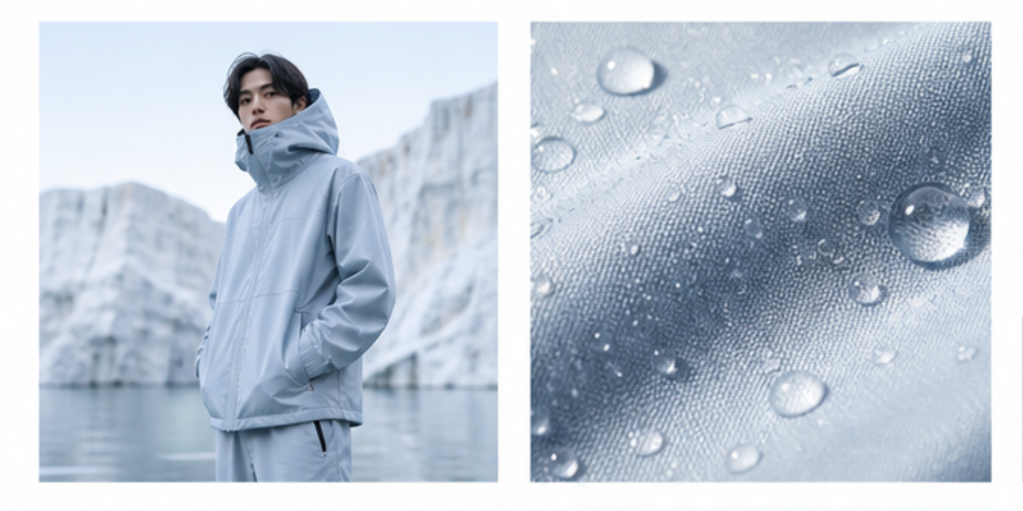
Neko is a fashion brand inspired by the encounter between Japanese visual culture and the Mediterranean world. Research led to the sea as the central concept: a bridge between distant cultures and a symbol of exchange, movement, freedom and identity. This narrative provided a meaningful foundation for the entire brand.
STRATEGIC VISUAL IDENTITY
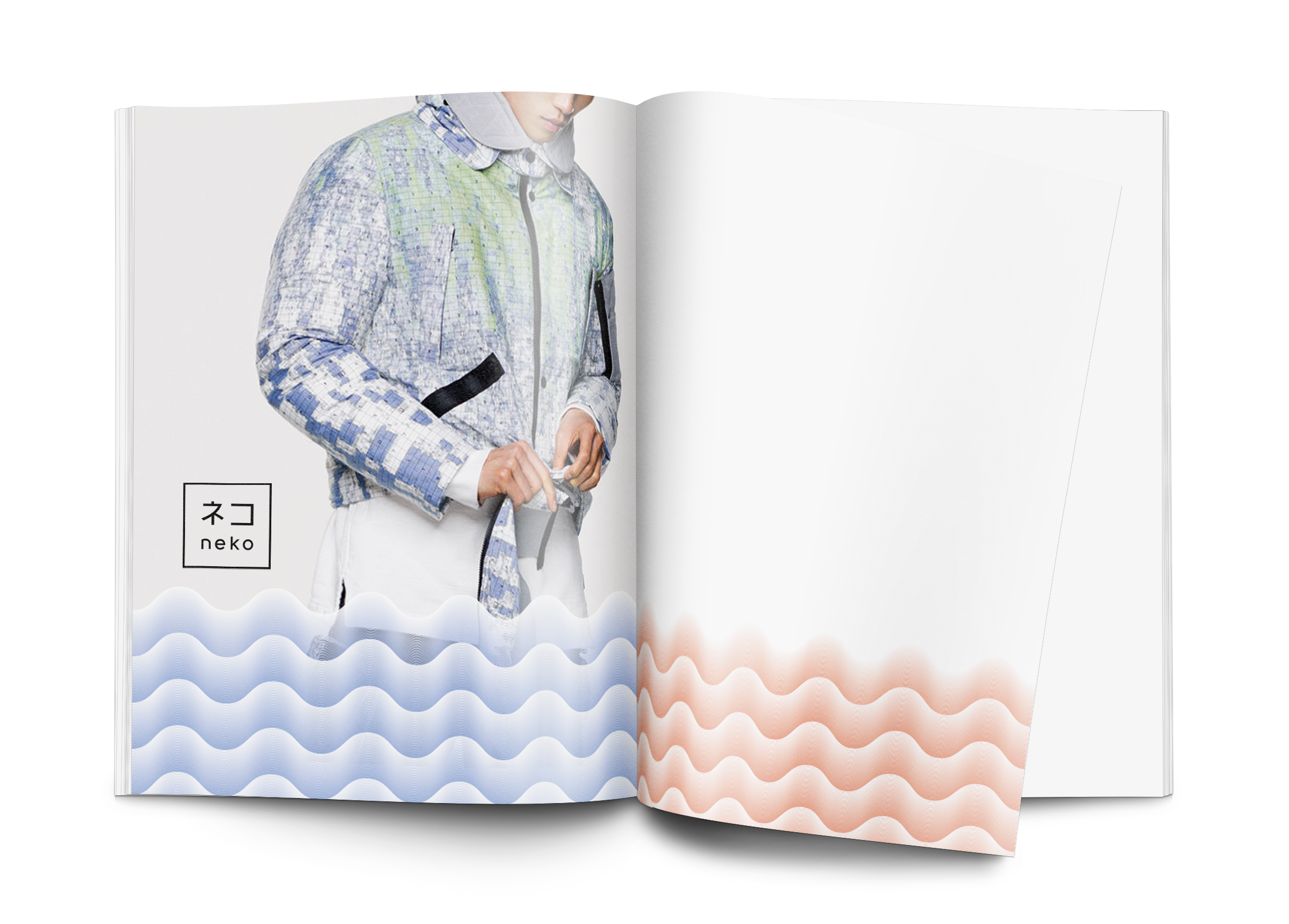
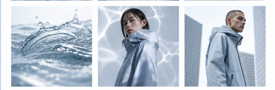
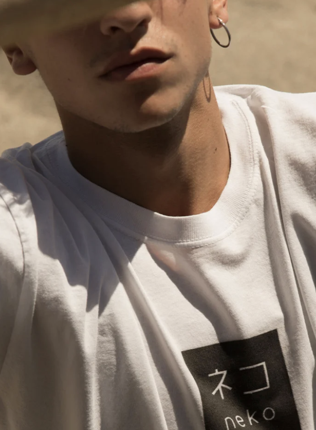
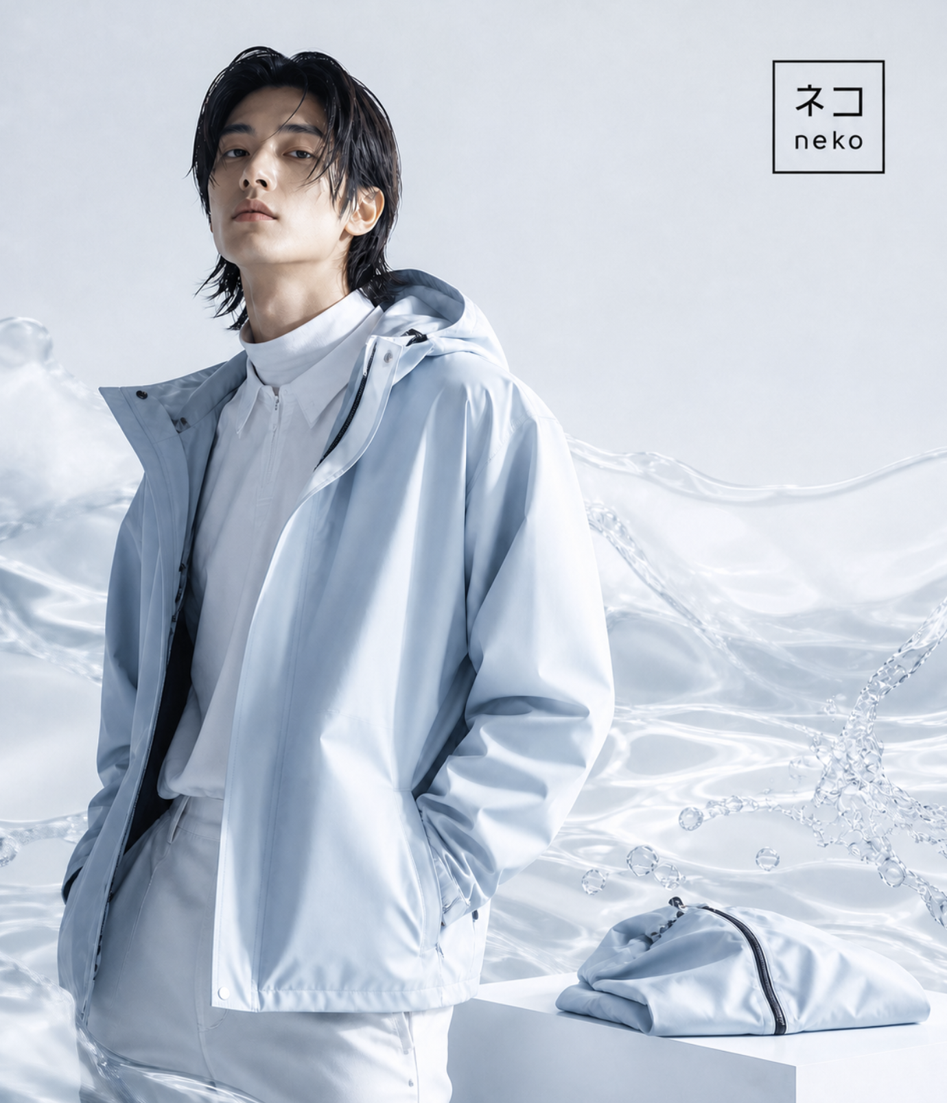
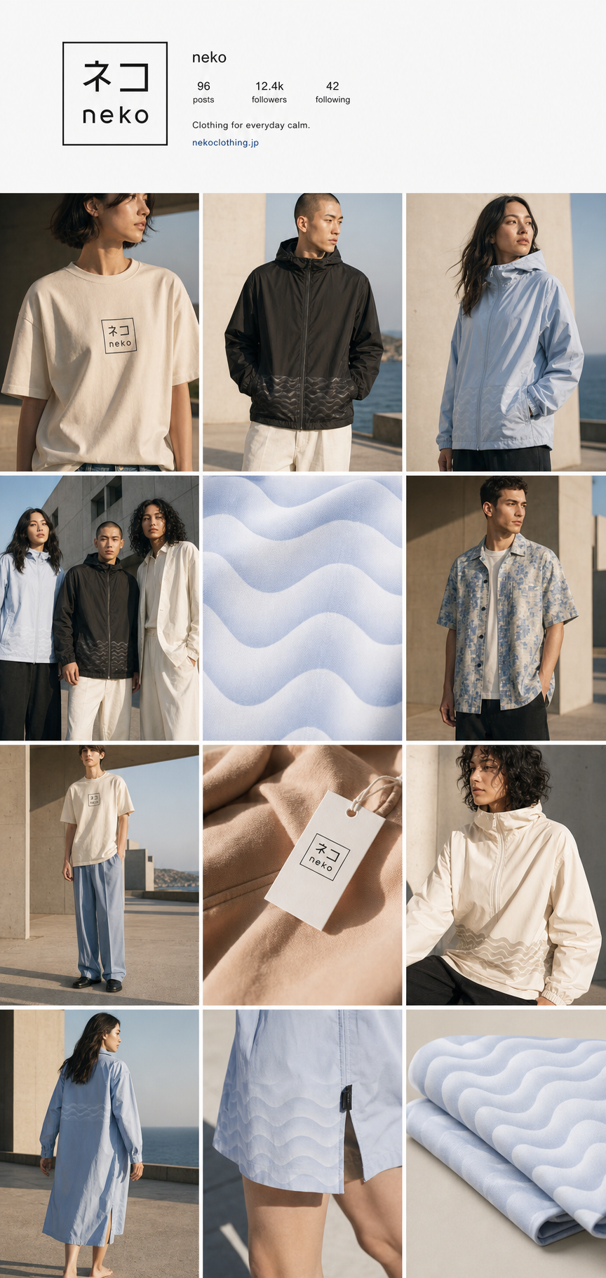
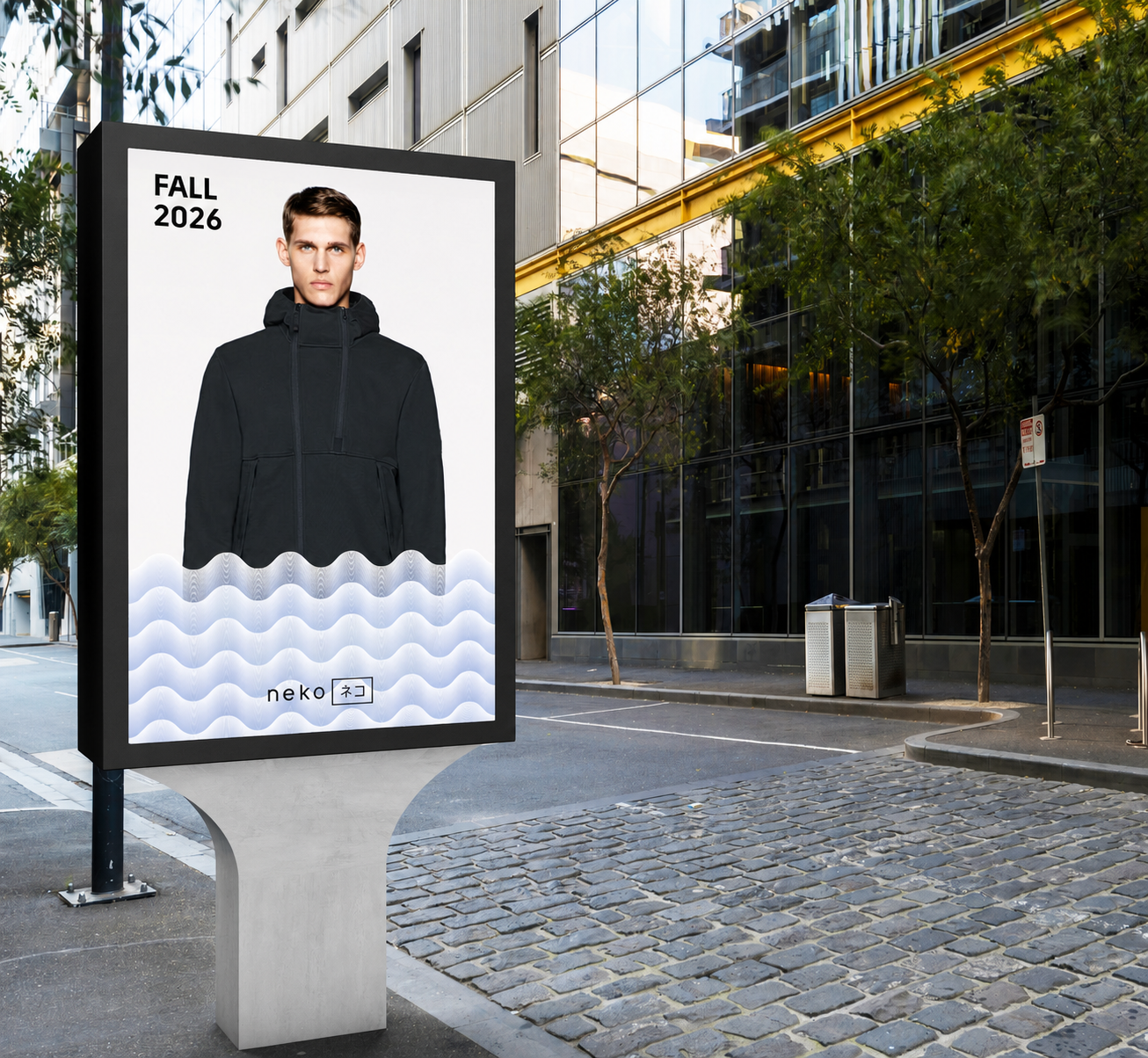
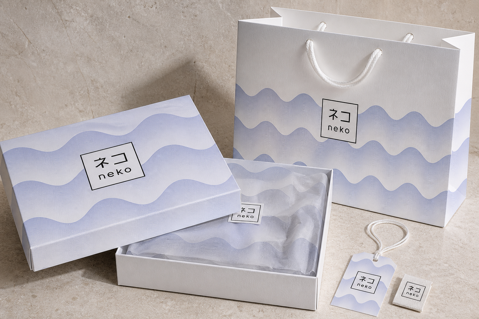
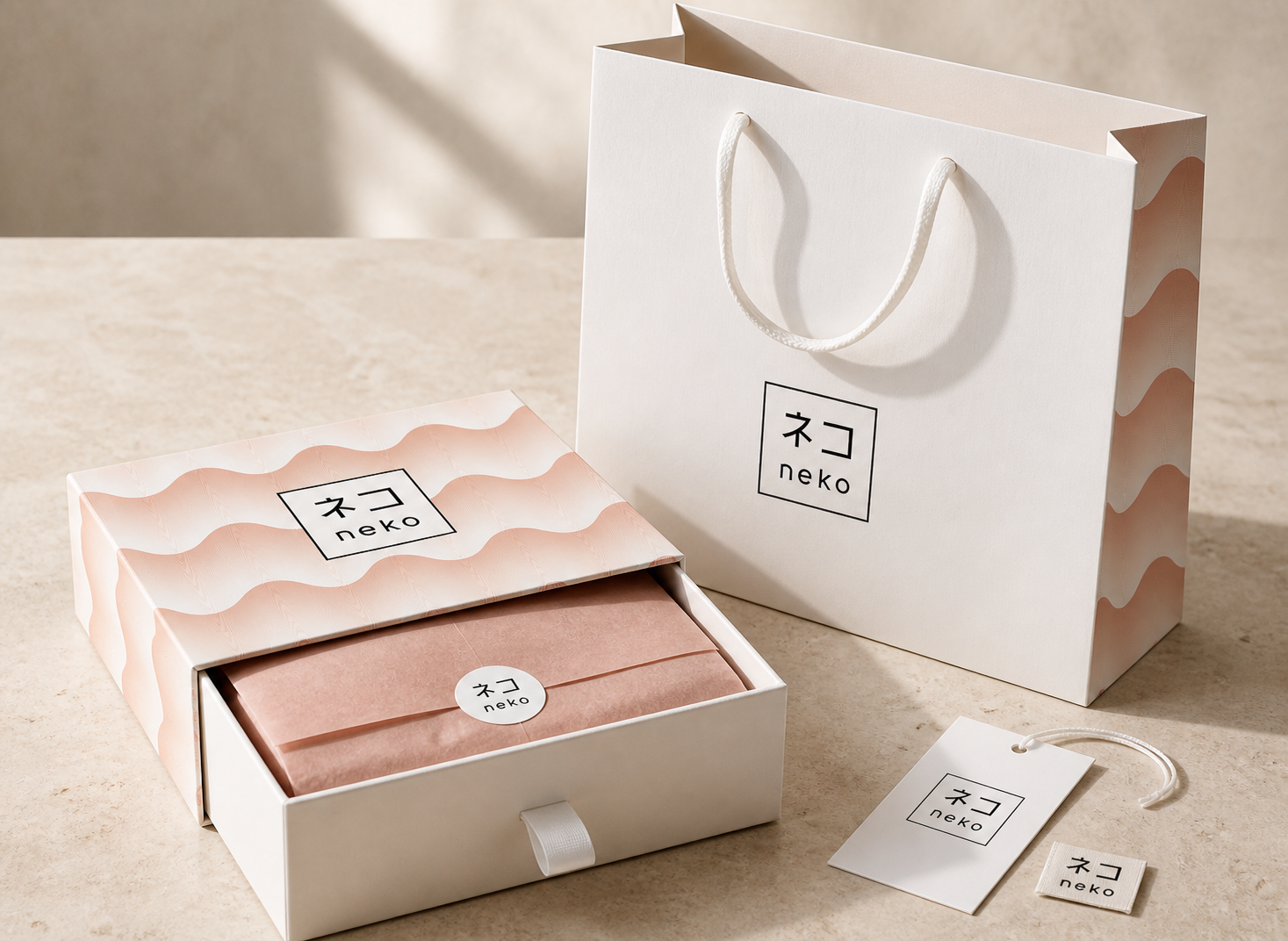
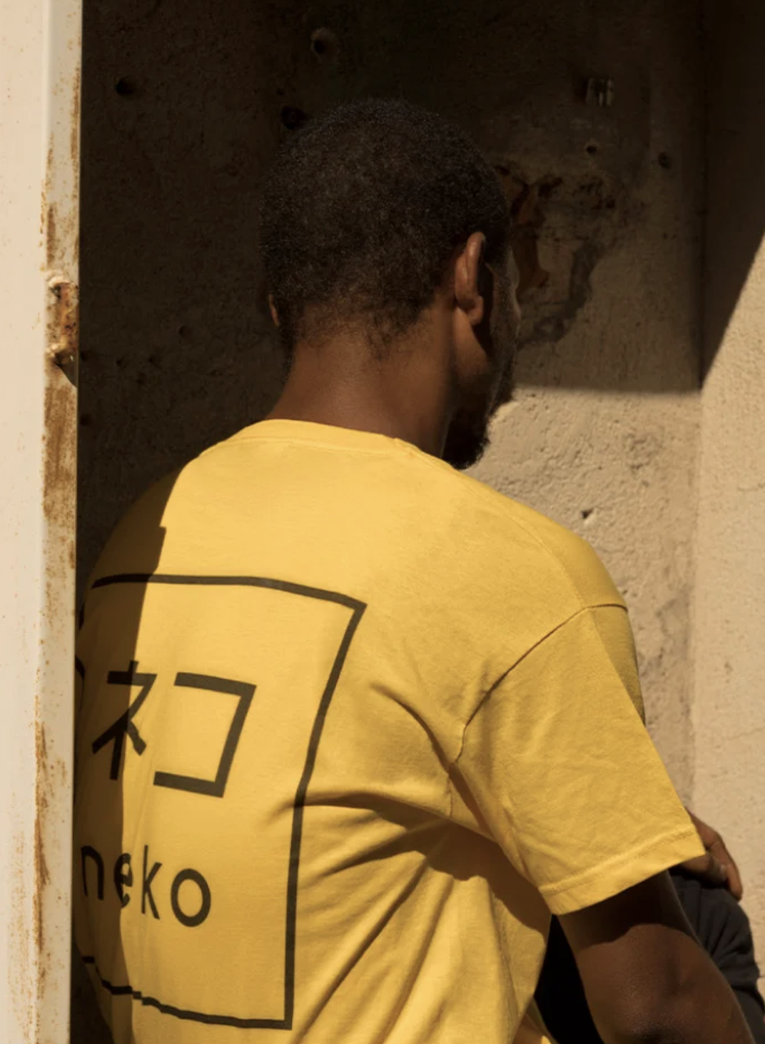
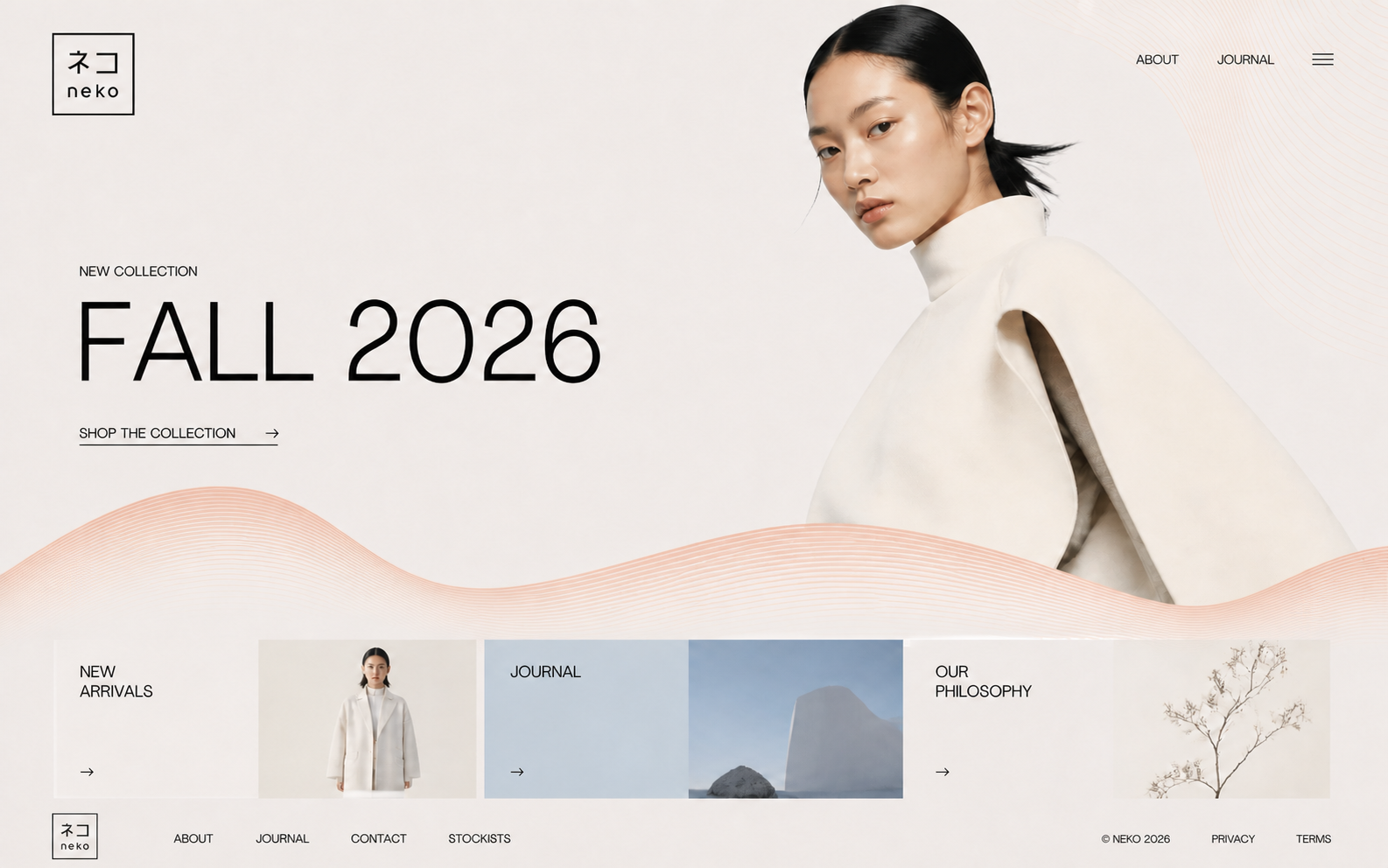
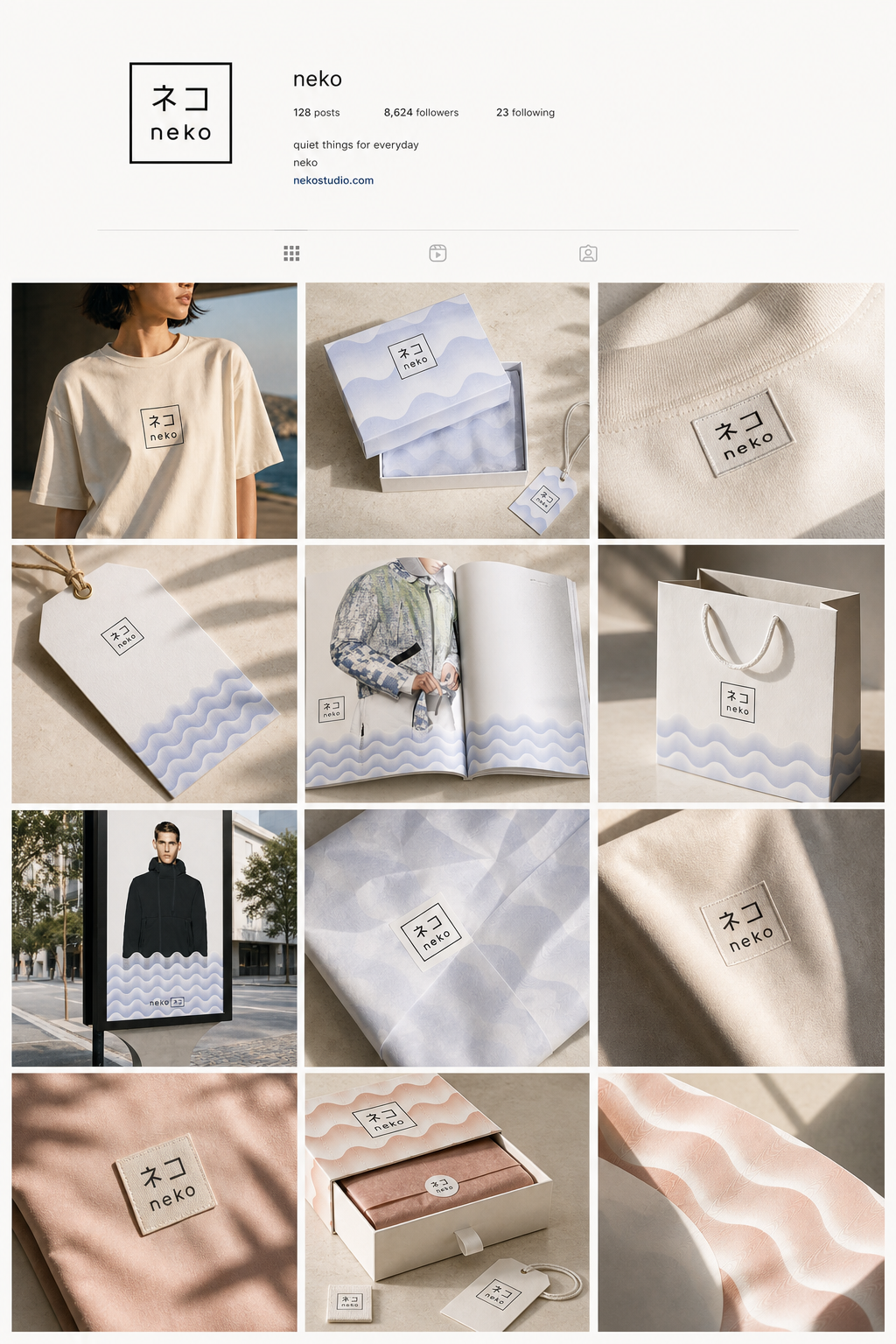
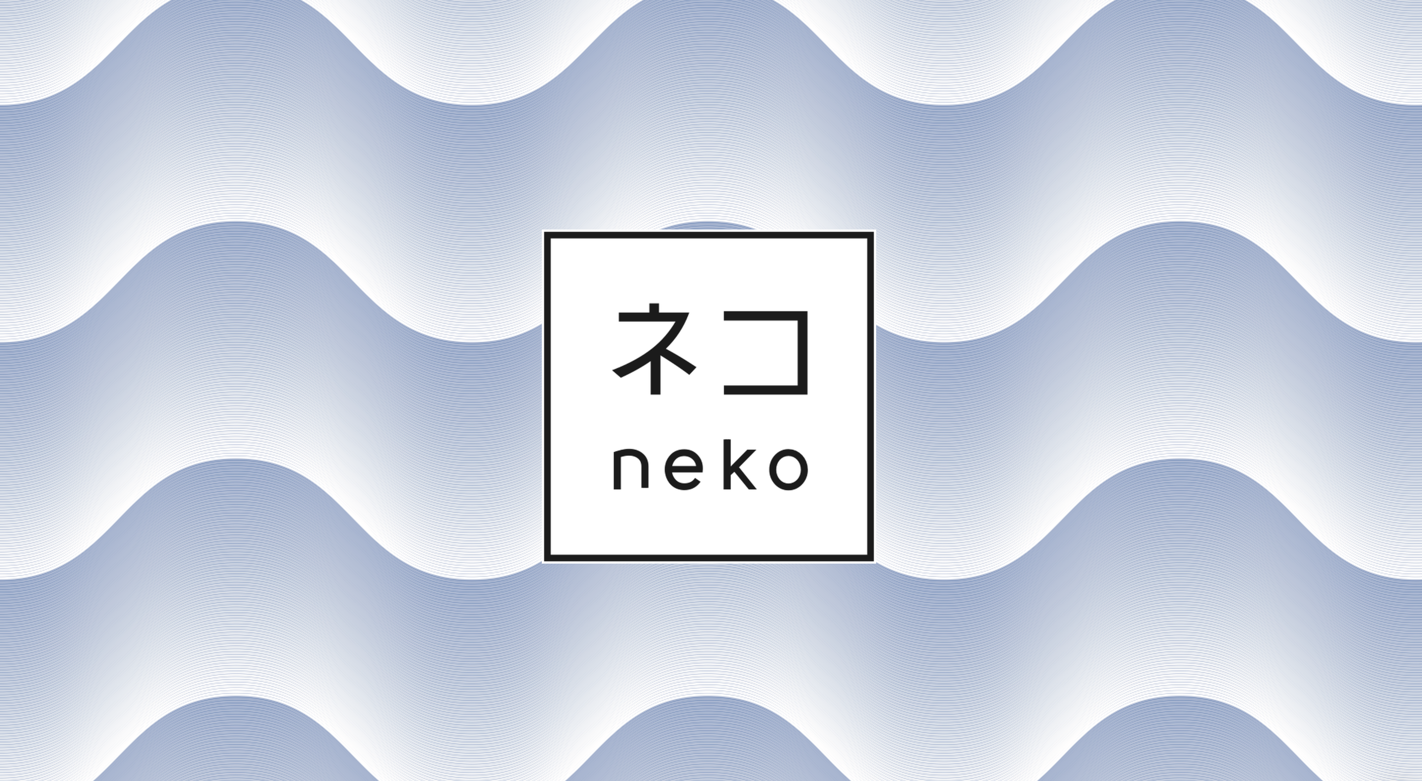
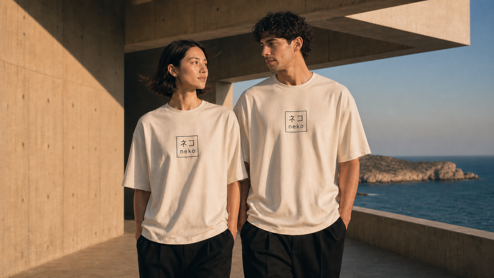
The identity balances Japanese precision with Mediterranean fuidity. A bilingual logo combining Latin and katakana characters establishes the brand’s cross-cultural positioning, while the geometric frame introduces structure. Wave-inspired textures, a blue and coral palette, and a clear typographic system translate the concept into a distinctive and internationally accessible visual language.
DESIGN SOLUTION
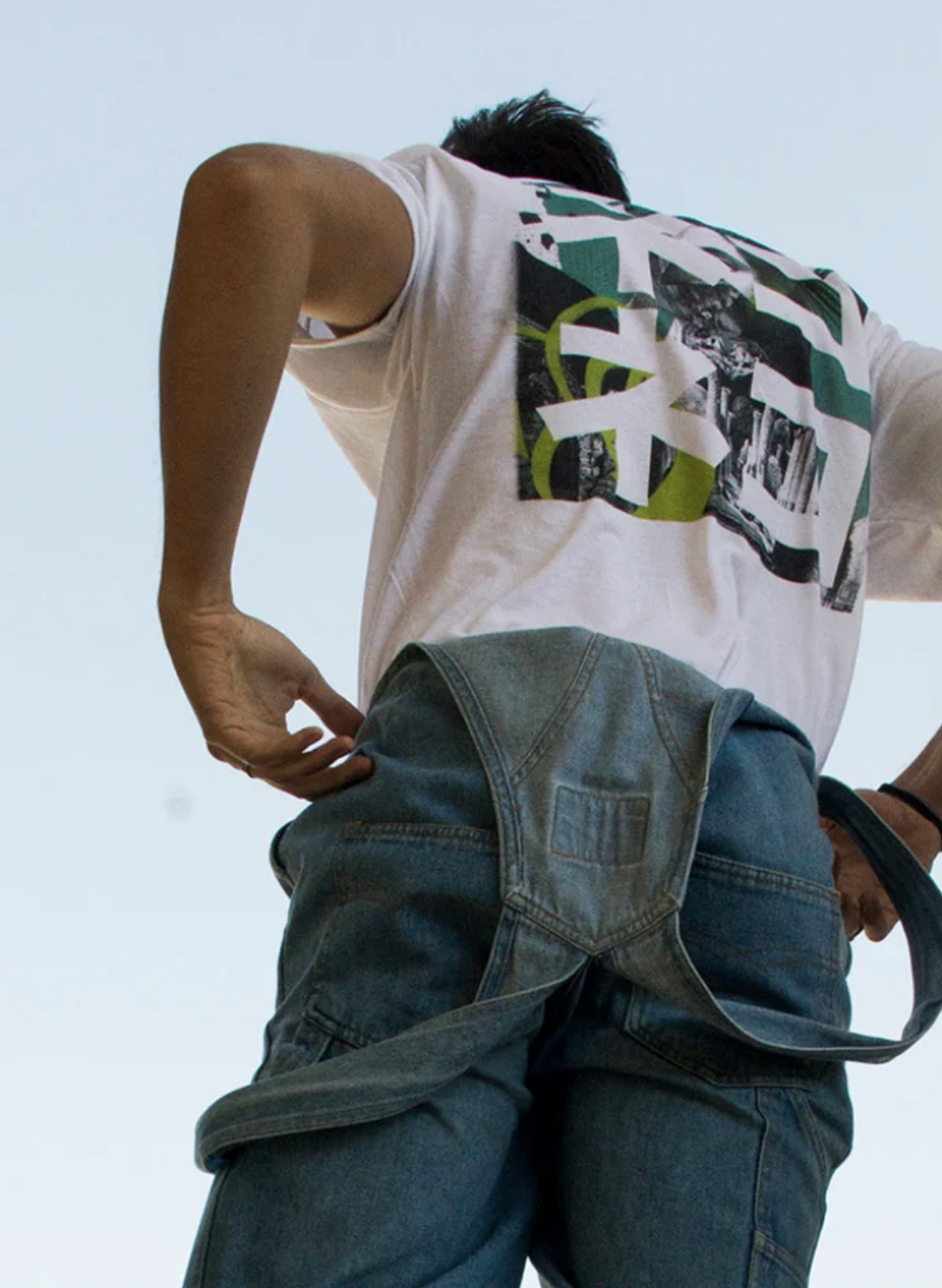
The identity was developed as a flexible system for both fashion and communication touchpoints, including garment labels, tags, brand guidelines, advertising, campaigns and digital content. The result is a recognisable brand that remains consistent across different formats, scales and audiences.
Neko
A dialogue between East and West
Between East and West
SERVICES
Brand Strategy
Visual Identity
Digital Design
Packaging
AI
CREDITS
Alfatauri Design Team
MY ROLE
Graphic Designer
DIVE DEEPER INTO MORE STORIES...
BACK TO TOP ☝️
©2026